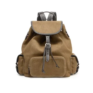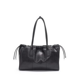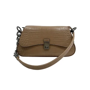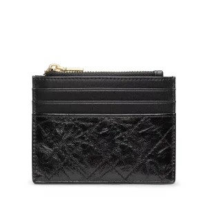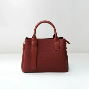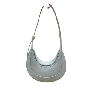
Jil Sander tactility is a useful material-development lens for 2026 because minimal handbags must earn attention through surface, weight, edge, and movement rather than decorative noise. Public Jil Sander runway reporting has moved between Spring 2026’s graphic purism and Fall 2026’s more lived-in roughness, while the Pre-Fall 2026 offer places bags inside a richer wardrobe context. For an independent B2B label, the opportunity is to engineer a quiet but memorable handfeel through original materials and construction.
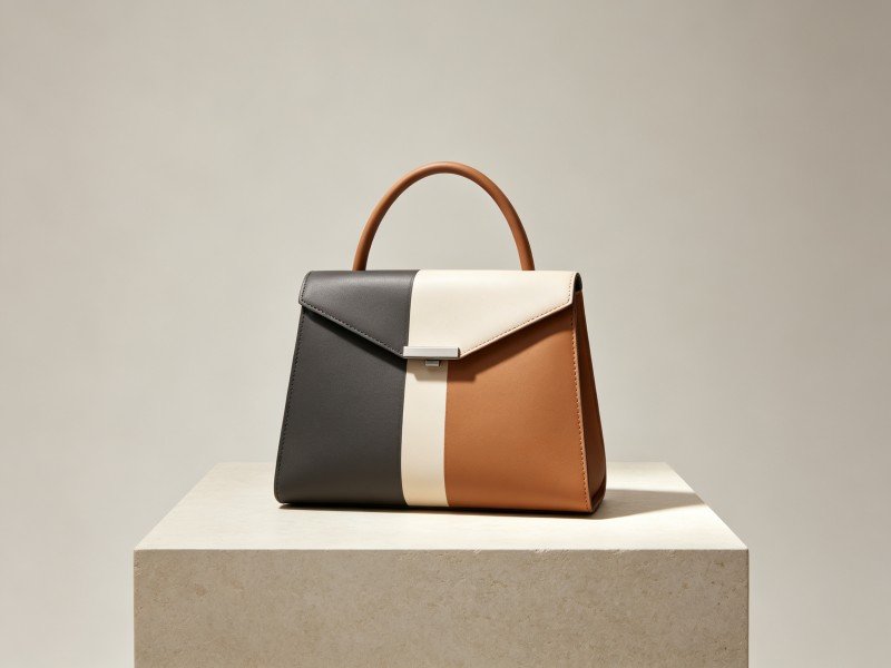
This is an independent material analysis, not a product recreation guide. It uses public runway and collection signals as context and translates them into questions about leather temper, textile friction, edge treatment, hardware sound, and long-term wear. It does not claim knowledge of Jil Sander’s suppliers or confidential production methods.
Minimalism is a sensory specification
A quiet handbag still makes many promises. It may promise a cool, dense handfeel, a precise edge, a soft fold, a reassuring closure, or a surface that improves with use. These promises are sensory specifications even when a product page describes them with only a few words. A sourcing team should therefore write them down before choosing a material.
Start with a sensory sentence: “dry matte body, controlled flex, quiet metal, clean edge.” Then translate each phrase into a test. Dry matte may require a rub comparison and a color-transfer check. Controlled flex may require repeated bending at the gusset. Quiet metal may require a carry sound review. Clean edge may require microscopic inspection after abrasion. This is how Jil Sander tactility becomes an actionable brief rather than an aesthetic mood.
Jil Sander’s Spring 2026 debut was described by WWD as a return to purism and “apparent simplicity.” That public signal does not mean a bag should be blank. It means small construction decisions have more responsibility because there are fewer decorations to distract from them. A slight shift in sheen, a visible seam turn, or a handle that sits exactly on the body can become the main visual event.
Leather temper controls the emotional temperature
Leather temper is the resistance a panel offers when pressed, bent, or released. A firm temper creates a clean plane and a sharper edge. A soft temper creates drape, compression, and a closer relationship to the body. Neither is automatically superior. The right choice depends on the silhouette, capacity, closure, and customer expectation.
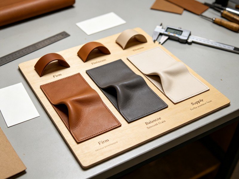
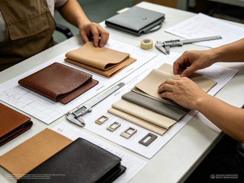
Develop three physical panels before approving a full prototype: firm, balanced, and supple. Mark the same stitch line on each panel and flex it through the intended motion. Inspect recovery, wrinkle depth, edge response, and noise. A soft panel may look attractive but require a more stable base. A firm panel may protect the opening but need a softer handle wrap. These interactions define Jil Sander tactility more reliably than a color name.
Grain also changes perception. A fine grain can make a dark bag look calm and durable, while a smooth surface exposes fingerprints and light changes. Nubuck or brushed finishes offer depth but may be more sensitive to transfer. A buyer should decide whether the surface is intended to remain visually constant or to record use as patina. That choice affects care language, packaging, and return expectations.
Edge treatment is where quiet design becomes visible
Edges are often the first close-up proof of quality. Folded edges create softness and protect a panel, but they require accurate thinning and a stable adhesive. Painted edges create a graphic line, but the paint must flex with the material. Turned edges can look precise while increasing labor and corner complexity. Raw edges may be appropriate for a deliberately relaxed product but need a clear fray and care standard.
Use a small edge library with the actual leather thickness, reinforcement, and finish. Bend each sample, rub it against light fabric, and check the transition at corners. Photograph the samples under neutral and warm light. A retail team can then understand why one edge looks more architectural while another feels more relaxed. This evidence helps a custom leather bag program turn a subjective preference into a repeatable instruction.
Edge color should be considered with the whole palette. Tonal edges preserve calm. A darker edge can sharpen a pale body. A contrasting edge can create a graphic signature, but it also increases alignment risk. Limit contrast to the places where it improves navigation, such as an opening or handle junction. Excessive contrast can make a minimalist bag look busy.
Hardware should be felt before it is seen
Hardware changes the perceived weight and rhythm of a bag. A dense slider feels secure; a hollow ring may sound thin. A polished finish catches attention; a brushed finish disappears into the material. The goal is not to maximize metal. It is to make every component feel proportional to the product’s purpose.
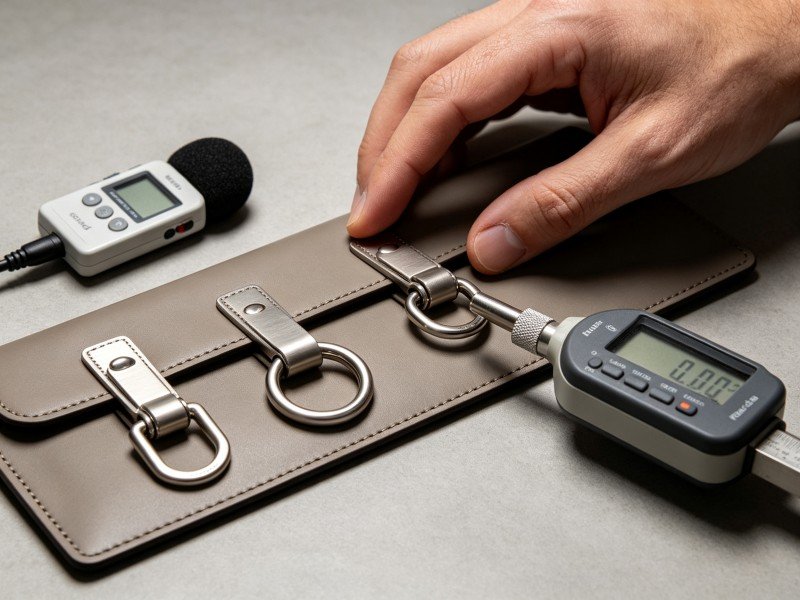
Test a closure with gloves, long nails, and one hand. Record force, travel, alignment, and sound. A quiet magnetic closure may support a soft shoulder bag, while a structured tote may require a more deliberate mechanism. The attachment should not create a hard pressure point against the hand or shoulder. Hardware can be simple and still be highly engineered.
Sound is an overlooked part of Jil Sander tactility. Carry the sample on a quiet corridor, open it repeatedly, and record whether rings collide with the body. If the bag is intended for a calm, professional setting, excessive rattle can undermine the product message. A leather wrap, a small spacer, or a revised ring radius may solve the problem without adding visual decoration.
Spring 2026 purism rewards disciplined surface contrast
WWD’s report on Jil Sander’s Spring 2026 show described austerity, narrow tailoring, and controlled graphic details. It also noted geometric protrusions and openings that kept the collection from becoming featureless. Applied to handbags, that suggests a disciplined contrast system: a matte body with a precise edge, a soft panel with a stable handle, or a quiet surface interrupted by one functional opening.
Surface contrast should clarify how the product works. A glossy puller can identify the entry point. A slightly different grain can mark the base. A transparent or lighter lining can make the interior easier to find. When contrast has no functional reason, it risks looking like an afterthought. This is where Jil Sander tactility becomes a decision framework for original design.
Keep the number of surface events low. One body finish, one support finish, and one hardware finish are often enough for a small range. More finishes increase sampling and create a higher chance of mismatched reflection in product photography. A calm product can still feel rich when the few chosen surfaces are accurate.
Fall 2026 adds useful imperfection
WWD’s Fall 2026 review described a move toward grit, grime, excessive fabric, worn-looking suede, sturdy tweeds, and a more selectively imperfect minimalism. The report connected the collection to Anders Petersen’s photographs of Hamburg’s Café Lehmitz and to Bellotti’s interest in roughness. These are public cultural references, not instructions to distress a handbag randomly.
For product development, imperfection should be controlled. A brushed surface may vary within an agreed range. A suede may show a directional nap that changes under light. A folded textile may have intentionally irregular movement but still require a stable opening. Build a tolerance board showing acceptable and unacceptable variation. Without that board, “lived-in” can become a reason to ship inconsistent goods.
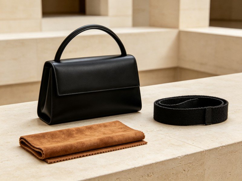
A material can also create roughness through context rather than damage. Pair a clean leather body with a coarse textile strap or photograph a precise bag in a lived-in interior. This allows the campaign to acknowledge Fall’s warmer mood without reducing the product’s life expectancy. For a private-label brand, it is a lower-risk way to test atmosphere while keeping the construction honest.
Weight and balance complete the handfeel
Customers often describe a bag as “substantial” when they are responding to balance, not absolute weight. A heavy clasp at the top can make a small bag tilt. A dense base can stabilize a tote but become tiring if the handle is narrow. A lined pouch can protect contents while making a transparent outer body feel bulky.
Measure the empty bag, the target load, and the distribution between body, handle, and hardware. Test hand carry, shoulder carry, and set-down behavior. A product should not slide away from the intended carry position or collapse at the opening when placed on a table. These physical observations are central to Jil Sander tactility because they are felt in the first few seconds of use.
Packaging changes the first impression as well. A soft bag packed too tightly may arrive with deep folds that do not recover. A structured bag packed without support may show pressure marks. Define the storage shape and the acceptable recovery window. Photograph the packaged and unpacked conditions for the receiving team.
Minimal surface, maximum care clarity
A quiet product needs precise care communication. Explain whether the surface can tolerate rain, denim transfer, hand cream, or frequent rubbing. If a finish is designed to develop patina, describe what change is expected. If a coating must be protected, state the limitation without hiding it behind luxury language.
Run care trials on production-relevant material. Test a neutral cloth, a damp cloth, and the recommended cleaner only when the supplier confirms compatibility. Photograph before and after. A buyer can then decide whether a material belongs in a daily product, a special-occasion product, or a limited editorial capsule. This makes Jil Sander tactility a transparent customer promise.
Care also affects channel selection. A boutique with trained staff may support a delicate surface more effectively than a high-volume marketplace. A travel-oriented retailer may require stronger abrasion evidence. The design can remain the same while the distribution plan changes, but the decision should be made before inventory is ordered.
Design a tactile family without repeating one bag
An original range can share a sensory point of view while varying function. One compact shoulder bag can emphasize soft compression; one tote can use a stable base and quiet hardware; one flat crossbody can highlight edge precision; one small evening bag can use a controlled sheen. The materials should relate, but the products should not become four copies of one body.
Use a family matrix with columns for surface, temper, edge, hardware, carry, capacity, and care. Mark where each product repeats a principle and where it introduces a new one. This prevents a range from becoming visually flat while keeping procurement manageable. It also gives the product page a clear reason for each style to exist.
For sampling, build the most revealing component first. If the concept depends on a special edge, approve that edge before cutting six colors. If it depends on a quiet clasp, approve sound and force before polishing a campaign sample. A custom handbag sampling process can document those gates and keep revisions tied to measurable observations.
OEM material brief for a minimalist collection
A material brief should name the target hand, surface, weight, flex, and recovery, then state the test that proves each one. Include color tolerance, edge method, hardware finish, lining, packaging, and care. Avoid references that ask a supplier to make a product “like” another brand. An original brief is safer and more useful when it describes behavior and customer benefit.
A luxury handbag OEM manufacturing solution can compare suitable leather, textile, and hardware options, but the brand should approve the visual identity. Ask for material alternatives at the same thickness and for a cost impact when a finish changes. This prevents an attractive sample from becoming an unplanned margin problem.
Quality gates should include handfeel, edge, hardware, balance, care, and packaging. Keep a retained standard for each gate and record the acceptable variation. If a supplier suggests a substitute, compare it under the same light, load, and carry position. A screen image cannot reveal weight or sound, so approval must remain physical.
For a private label bag manufacturing service, the commercial conversation should include launch channel, expected use, target quantity, and replacement parts. A spare slider or pouch may be inexpensive compared with a full return. Repair access is not an afterthought; it is part of the product promise when a minimal surface makes small defects visible.
Tactile approval checklist
- Surface: Is the finish consistent under daylight, retail light, and phone-camera exposure?
- Temper: Does the material recover after the intended carry and storage cycle?
- Edge: Does the treatment survive flex, rubbing, and corner handling?
- Hardware: Are force, sound, weight, and attachment proportionate?
- Balance: Does the product sit correctly when empty and loaded?
- Care: Can a customer understand the limits without vague claims?
Turn tactile restraint into a defensible product promise
The useful lesson of Jil Sander tactility is not that minimal products should be empty of character. It is that character can be carried by temper, edge, weight, sound, and controlled surface contrast. Public 2026 runway signals show how a purist base can absorb richer texture without abandoning clarity. An independent label can build its own version through original construction and honest testing.
Dongguan Junhao Handbag Co., Ltd. can review an original material brief, compare tactile prototypes, and align testing with a private-label launch. Explore our custom leather bags capabilities or send your RFQ with target handfeel, materials, quantities, carry modes, and channel requirements.
At the final gate, use Jil Sander tactility as a practical review label. Confirm that Jil Sander tactility is visible in the surface sample, that Jil Sander tactility is supported by an edge test, and that Jil Sander tactility remains comfortable under load. Confirm that Jil Sander tactility survives the care trial, that Jil Sander tactility is consistent across the approved color lot, and that Jil Sander tactility does not depend on a copied visual code.
Ask the supplier to record Jil Sander tactility through handfeel notes, force readings, sound observations, and retained samples. Ask how Jil Sander tactility changes after compression, how Jil Sander tactility behaves after rubbing, and how Jil Sander tactility will be protected in shipping. Ask whether Jil Sander tactility can be repaired, whether Jil Sander tactility can be repeated at the planned quantity, and whether Jil Sander tactility is explained honestly in care copy.
When a material substitute is proposed, compare Jil Sander tactility in the hand, under light, and during carry. Compare Jil Sander tactility at the opening, at the handle, and at the base. A short physical comparison protects the product promise better than a screen approval. It makes Jil Sander tactility a documented quality standard rather than a vague adjective.
Original-design reminder: Use public fashion research to study general principles of restraint, surface contrast, material behavior, and quality. Develop distinct patterns, proportions, closures, hardware, and visual identity through your own design process.
This article is an independent educational analysis. It is not affiliated with Jil Sander. We do not produce counterfeit or replica goods, and we do not reproduce protected logos, trademarks, patterns, proprietary designs, hardware, silhouettes, or brand-identifying elements.